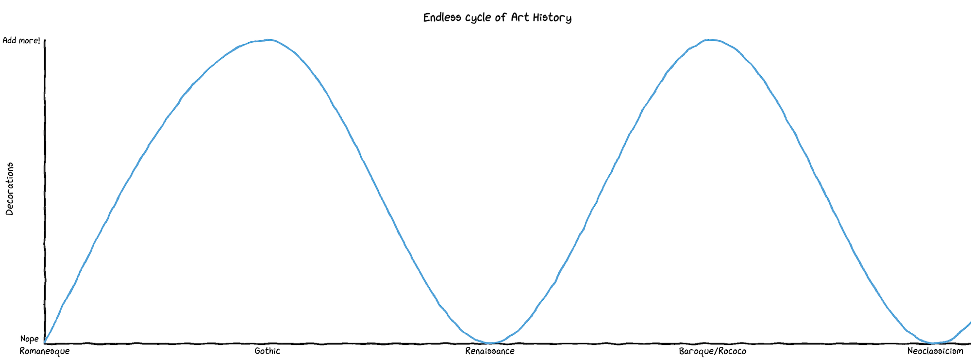
Art history shows us that we tend to move between adding “unnecessary” elaborate decorations to clean styles and back again. It’s almost an endless cycle repeated over and over.
This cycle happens in the different arts and other fields where design is involved, like software. Let’s trace it in architecture first.
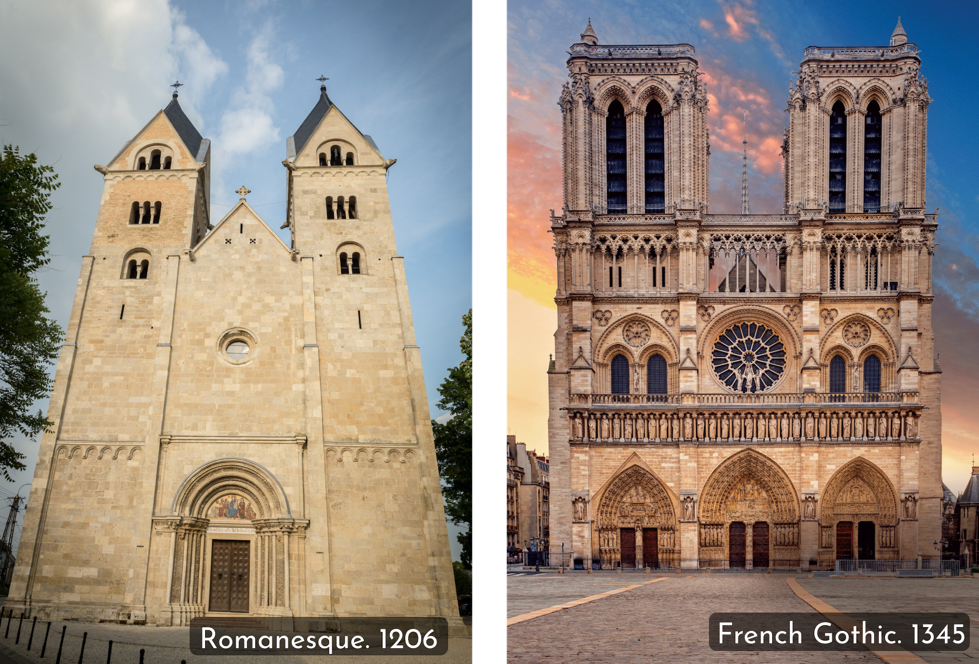
Here is the Abbey Church of St James in Hungary (1206), a clear example of the Romanesque style. By its side, Notre Dame, completed in 1345. Take a moment to appreciate all the decorations in the second picture not present in the first one.
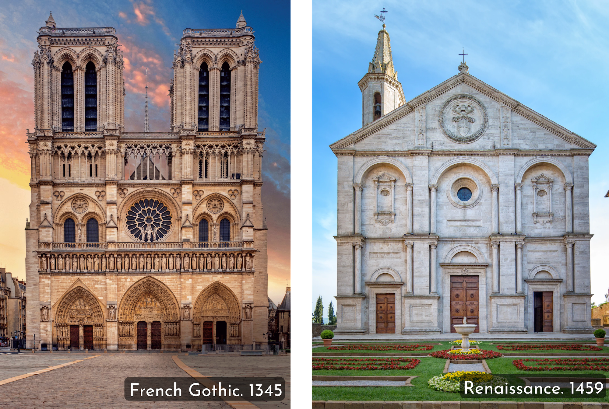
This tendency to add more details and decorations to an already functioning element of architecture went out of fashion (like it had done in previous periods). Here, you can compare Notre Dame with the Cathedral of Pienza, an example of Renaissance architecture.
So, 250 years to realize again that we don’t want to add so many grandiose elements and prefer simplicity?
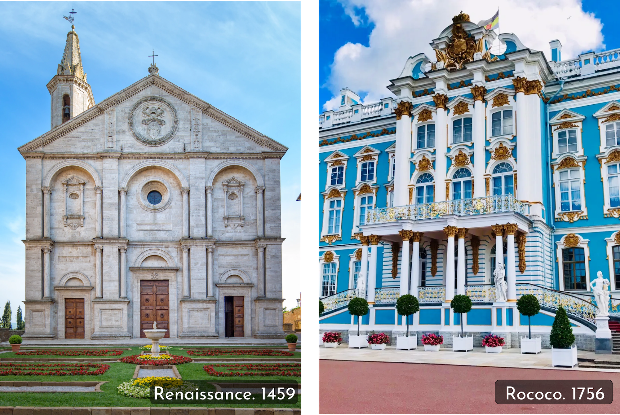
If we move to Baroque and Rococo, it’s like going in the opposite direction again, adding more and more decorations that weren’t essential to the buildings. Here’s the Cathedral of Pienza compared to the Catherine Palace in Russia.
But after a while, we got tired and returned to simple and clear lines.
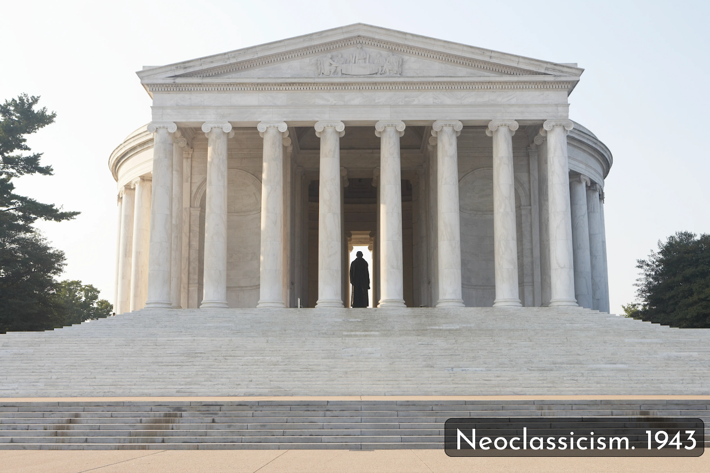
The cycle between this highly detailed and elaborate style and returning to simple and clean elements is not perfect. Art is a complicated combination of influence, technique available at the time, and the historical context in which it’s developed. However, the pattern is there.
The cycle is not only present in architecture. It can also be found in painting, photography, sculpting, literature, theatre, and even fashion. So it’s not surprising that we see it in software.
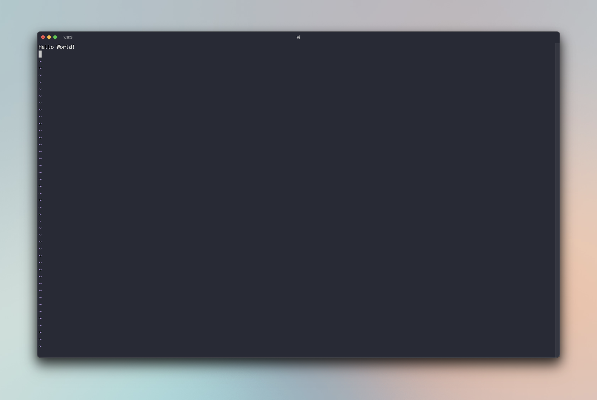
This is one of the first text editors: vi. It was created in 1978, and it is as simple as it gets visually. Although you need to learn a shortcut or two to use it :)
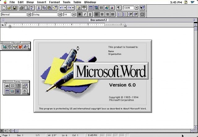
Here’s Microsoft Word, the king of text editors for a long time.
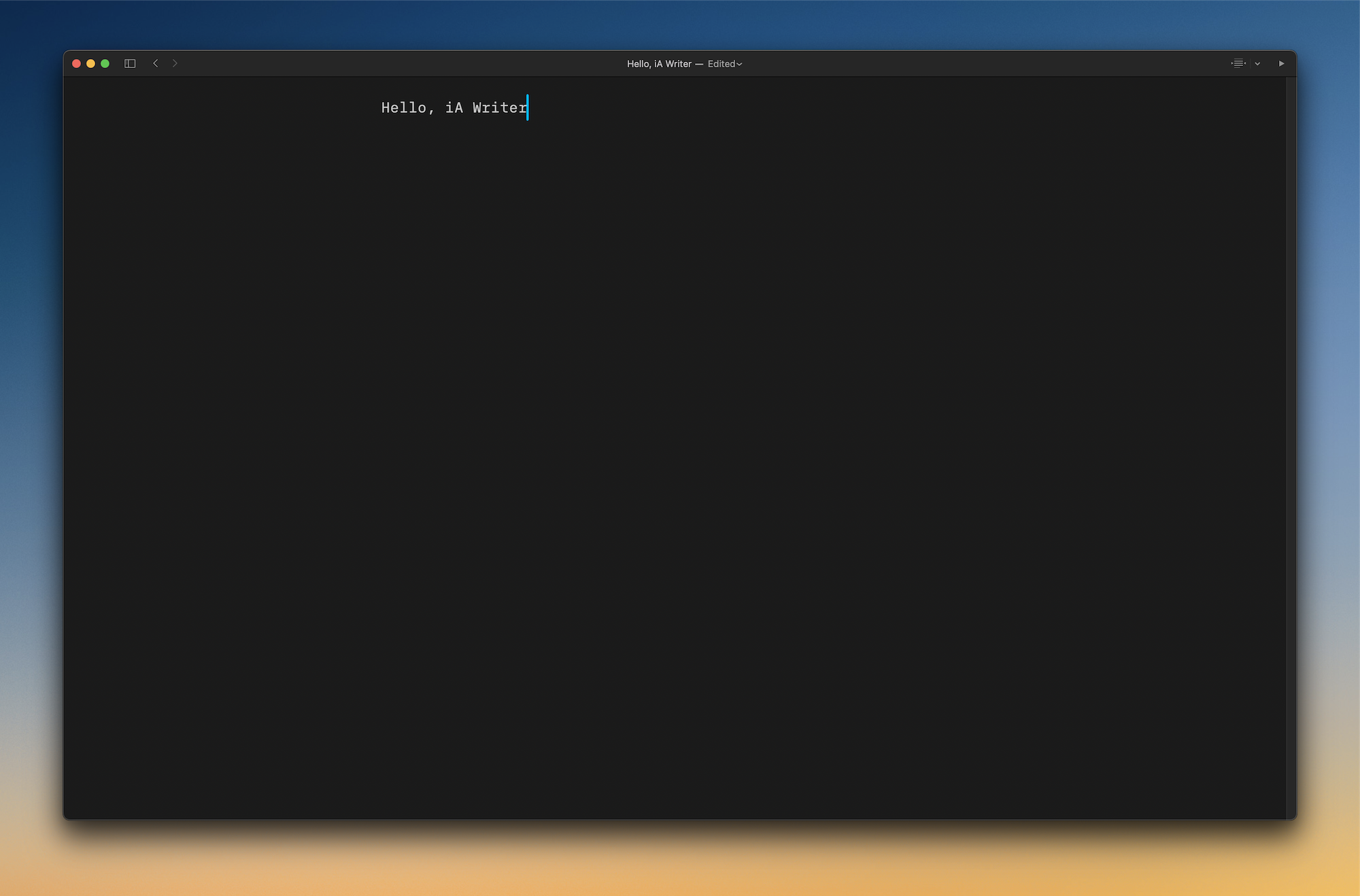
You could say it’s just the technology that didn’t allow developers to create something more visually appealing in the early 80s, and that’s partially right. But now, technology lets you do much more, and people are returning to this minimalism. Here’s iA Writer, a text editor for Mac I use to write these articles, and loved by many people.
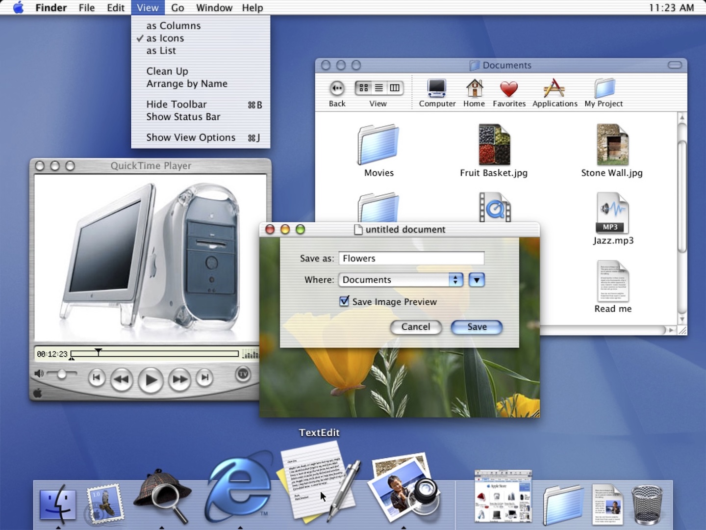
You can find a similar tendency in Operating Systems like Mac OS. Here’s Mac OS X 10.0 (released in 2001).
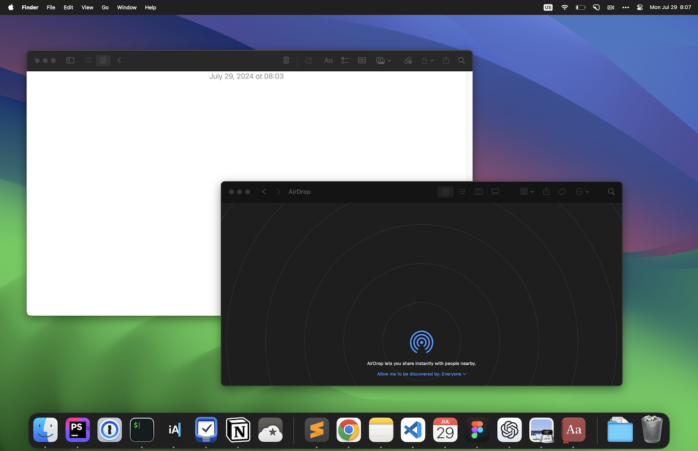
And we’re clearly back to clean interfaces in a recent version of Mac OS X 14.0, released 22 years later.
Will We Go Back to “Rococo” Software?
I know it seems impossible now, but we’ll certainly will.
We naturally get tired of the same design styles over time, so we’ll get a new wave of overly designed software in the next few years. Given its reduced timeline compared to architecture or painting, software will take more time to see this cycle clearly, but it’ll be there.
That said, if we see software design as an independent visual art, it’s also possible that this change happens much more quickly, and what takes 100 years in architectural styles to change could take ten years in software. Only time will tell.
In the meantime, let’s enjoy this period of mostly simple software that focuses on doing one thing without distracting you.
